Blog
All Blog Posts | Next Post | Previous Post

 FNC & VCL: The best of both worlds, part 1: Buttons
Bookmarks:
Wednesday, September 27, 2023
Intro
The purpose of this blog series is to let you get familiar with the various kinds of components we offer, and in particular, the ones from the TMS VCL UI Pack & the TMS FNC UI Pack. There are quite a significant amount of blogs covering both products, but only in a few occasions, the sheer power and flexibility of combining both is being highlighted. We tend to focus on one or the other as often the confusion takes over as to which one we need to choose for our application. Actually, there should not be any confusion as both products can be used simultaneously in the VCL framework and within one and the same application. Below is a quick summary of the advantages of both.
TMS FNC UI Pack
- Flexible and highly customizable
- Easily extendable
- Operating system specific functionality
- Supported Frameworks
- FMX (FireMonkey)
- VCL
- TMS WEB Core
- Lazarus
TMS VCL UI Pack
- Seamless integration with the Windows operating system
- High amount of features per component
- Endless possibilities
- Supported Frameworks
- VCL
Both TMS FNC UI Pack and TMS VCL UI Pack support VCL and therefore go hand in hand when it comes to developing applications. The blog post of today will focus on buttons. We have picked a set of button type components we think will enhance your application and take it to the next level.
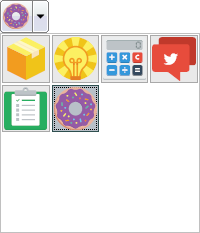
Buttons
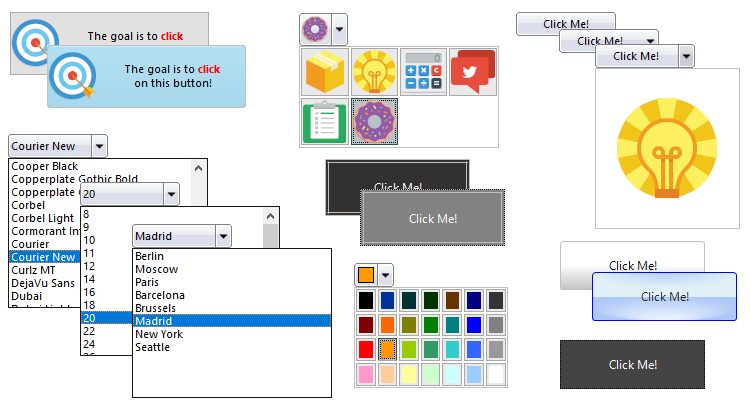
TAdvGlowButton

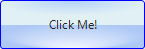
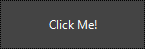
TAdvGlowButton is part of TMS VCL UI Pack and mimics the Windows / Office style button. An important feature is the recognizable glow effect when hovering as well as support for fully customizable complex gradients. This button also uses GDI+ which has transparency, and antialiasing & clear type text rendering support. Additionally, it can also be configured as a dropdown button. If you want to give your application a Windows / Office style vibe, then this button has everything you need. This button is available in the TMS VCL UI Pack.
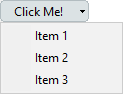
TTMSFNCToolBarButton
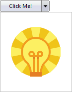
This button is designed from scratch and has a unified look and feel, perfect for creating applications that really need that unique design. This button is fully customizable and has support for a dropdown control. This button can also be integrated in a TTMSFNCToolBar or TTMSFNCRibbon, which will be covered in a later blog post. Together with TAdvGlowButton and TAdvToolButton, this button will enrich your application. As this button is part of TMS FNC UI Pack, it's also available for platforms such as macOS, iOS, Android and Linux as this is the case with any FNC control.
TAdvSmoothButton / TAdvSmoothToggleButton

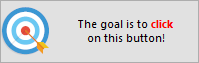
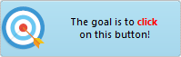
This type of button was initially designed for touch enabled screens running the Windows operating system and was inspired by one of the first iOS versions. This button has a flat style as well as that unique iOS look and feel and also has support for a variety of office styles. Additionally, the TAdvSmoothToggleButton has the ability to stay pressed. Both buttons also have a unique "click repeat" feature that when true, keeping the finger or left mouse button pressed will endlessly trigger the OnClick event until being released. This button is part of TMS VCL UI Pack.
TTMSFNCButton
TTMSFNCButton is based on a default TButton component and adds HTML text and image support. The image is capable of rendering SVG images. As this button inherits from TButton, it will automatically follow the style of the application and operating system. This button is part of TMS FNC UI Pack.
TAdvToolButton
This button is the TMS VCL UI Pack counterpart of TTMSFNCToolBarButton, it has similar features as well as the ability to be used inside a toolbar.
Variations of TTMSFNCToolBarButton
There are a couple of variants of the TTMSFNCToolBarButton that add extra functionality. The look and feel of the button will remain the same, but the features are different.
TTMSFNCToolBarBitmapPicker
TTMSFNCToolBarFontSizePicker
TTMSFNCToolBarFontNamePicker
TTMSFNCToolBarItemPicker
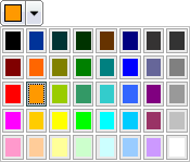
TTMSFNCToolBarColorPicker
Feedback
Not finding what you are looking for? Missing something in one of the buttons in this blog post? Please let us know! There are tons more controls in both TMS VCL UI Pack & TMS FNC UI Pack including some buttons that are not covered here. We are more than happy to help you find the correct component for your application.
What's Next?
In the next blog post, we will focus on TAdvMemo & TTMSFNCMemo. Stay tuned.
Pieter Scheldeman
Bookmarks:
Related blog posts

This blog post has not received any comments yet.
All Blog Posts | Next Post | Previous Post