Blog
All Blog Posts | Next Post | Previous Post

 Extend TMS WEB Core with JS Libraries with Andrew:
Optimizing CSS: Bootstrap, Sass, and Tailwind CSS
Bookmarks:
Tuesday, April 18, 2023

Motivation.
Almost every modern web application, after passing through any number of compilers, transpilers, and minifiers, ultimately ends up as some combination of JavaScript, HTML, and CSS files. A browser then loads these files (varying in size from 0 bytes to several MB each), and processes their contents using its own internal compilers and optimizations. This may lead the browser to download even more JavaScript, HTML, and CSS files, leading to even more compilation and optimization steps. This can very quickly spiral out of control.
The browser then ultimately renders something resembling a web
application onto the page. There are exceptions - most notably related to the arrival of WebAssembly. And there
are other files that are routinely brought into the mix, including fonts, images, and other data - under the
direction of these same JavaScript, HTML, and CSS files. Opportunities for optimization ahead of time arise from the
potential to reduce the size or complexity of any of these ingredients - the JavaScript, HTML, and CSS files
directly involved, but also the fonts, images, and other data.
We'll focus on optimizing the other ingredients in other posts, but in this post, we're going to focus on CSS. And by "optimization" we're going to keep two aspects in mind - the amount of CSS being generated, naturally,
but also the developer effort required to generate and subsequently customize or maintain that CSS. At times,
these two aspects can be at odds with one another. Some of the CSS tools we'll be looking at are really easy to
start using, but generate a large volume of CSS that the browser has to process. Or perhaps we can spend a lot
of time with a different tool but end up with a relatively minimal amount of CSS to hand over to the browser. There are tradeoffs everywhere.
CSS Files.
Briefly, we should have a clear understanding of what CSS files are, and what they are intended to do. Their name - CSS - gives us a bit of a clue: Cascading Stylesheets. A typical CSS file is just a regular text file, with a .css extension, that the browser parses when the CSS file is loaded. CSS files associated with a given HTML page can be listed in the <head> element in the HTML file for the page.
For TMS WEB Core
projects, CSS files are typically added to the Project.html file. As these tend to be Single Page Applications
(SPAs) adding a link to one or more CSS files there is often all that is required. For example, we can add a
new CSS file to our project in the Delphi IDE using the File | New | Other | Web
| CSS Stylesheet. If we then rename this new file from "Untitled1.css" to "custom.css", we can add a
link to it in Project.html that looks like this.
    <!-- Custom CSS file -->
    <link href=" custom.css " rel="stylesheet">
Multiple CSS files can be linked in this way, and this is often done when CSS files are included in other JavaScript libraries that we might be using in our projects. CSS <style> blocks can also be embedded directly in HTML files (typically also in the <head> element), which sometimes happens when just a small amount of CSS is needed - like setting the main background color or something like that. This approach might be employed to avoid having the browser make another network request for something trivial, which slows down the ever-important initial page rendering time.
So what can we find in these CSS files (or <style> elements) anyway? At its most basic, each CSS file
contains a set of rules that are used to apply CSS properties to HTML elements using CSS selectors. So what's a
CSS selector? It is a pattern that the browser uses to match one or more HTML elements. The most common pattern-matching mechanisms involve identifying HTML elements using at least one of these components.
- ID - an HTML element that has an ID can be matched directly using the "#" prefix along with the ID value. As ID values should be unique across a page, this pattern-matching mechanism will generally mean that the selector will match only one element.
- Class - by prefixing a CSS selector with a "." all HTML elements with that class assigned can be targeted.
- Tag - a selector can specify any tag - like <button> or <img> tags, or any other tag. These appear in the rules without a prefix.
- States and attributes can also be used, involving increasing levels of complexity.
CSS rules applied to an element most often also apply to the descendants of an element (this is where the
"cascading" comes from). CSS selectors can be combined in all kinds of ways to target any single element or
combination of elements on the page. More complex CSS selectors can be used to identify specific children, as
well as various states of an element (whether a mouse is hovering over a button, for example).
The first part
of a CSS selector may identify an element, and subsequent parts of the selector may be used to refine the
matching further, without any particular limitations on how many levels deep a selector can reach. Multiple CSS
selectors can also be defined in the same rule, comma-separated, so that all the properties apply to one or
more CSS selectors at the same time.
Let's look at an example of a CSS rule. Here, there are two separate selectors. The first matches all buttons
that are the immediate children of the element with an id of "header". The second matches all elements of any
kind anywhere on the page that have a class value of "BlueBG". The rule then stipulates that the background
color for all of these is set to "blue". Note that everything in CSS is case-sensitive.
  #header > button,
  .BlueBG {
    background-color: blue;
  }
What kinds of properties can a CSS rule change? Quite a few! The most common that we'll see used are for
things like an element's background color, or its size and position. There are hundreds of other properties
that can be set using CSS rules. Everything from A (animation and alignment properties) to Z (z-index - used to
layer elements on top of one another in a specific order). A given rule can include setting multiple
properties at once, again without any particular limitations on how many CSS properties can be set at one time.
There are even a handful of CSS properties that are used as shorthand for a set of other properties, allowing us
to change a number of property values at one time. For example, we can change the border of an element using
either the "border" property or the "border-width", "border-style", and "border-color" properties. These are
equivalent.
.border1 {
  border: 1px solid white;
}
.border1 {
  border-width: 1px;
  border-style: solid;
  border-color: white;
}
There aren't any errors generated as a result of CSS - either the rule is applied to an element or it is not. If an invalid rule is created (maybe a syntax error or a typo of some kind) generally the rest of the CSS file will be ignored. What happens when an element's property matches more than one CSS rule?
The application of the rules has a set of rules of its own, called specificity. The TL;DR version is that a more specific selector will take precedence over a less-specific selector. Selectors that reference IDs (#) take precedence over classes (.), which take precedence over tags and other identifiers like attributes. Wildcards tend to be the least specific, and adding "!important" to a property will usually help it win the specificity game - but not always. Adding CSS directly to an HTML tag using its style attribute (aka inline CSS) tends to take precedence over everything else.
In short, it is a bit of a mess, and we'll see
some examples of this mess shortly. But, despite this, it is ultimately flexible enough to get the job done
even if it is a bit frustrating at times. One approach is to just add our custom CSS file as the last CSS file
in the project, and then adjust our rules to be as specific as possible to ensure that they take precedence over
whatever comes before them.
The DOM.
When a browser loads up a page, it builds a Document Object Model (or DOM) - essentially a tree structure containing all the HTML elements on the page. It then looks through all the CSS rules that it has been directed to use and determines which rules apply to each element in the tree. It also has a set of its own default CSS properties that it applies in the absence of any other CSS properties, which is what we see when no CSS is used at all.
Different browsers have different defaults, naturally, which has given rise to various "reset" or
"reboot" CSS stylesheets - a set of CSS rules that can be used to standardize these properties so that a given
web page will look the same, or as close as possible, when rendered in different browsers. For example, one
browser might use a sans-serif font by default, and another might use a serif font. A particular reset.css file
will choose one of these so that any subsequent content on the page will be the same regardless of browser.
Once the browser has applied all the CSS rules to its DOM, it is ready to render the page. An HTML file that contains thousands of elements, each potentially having a handful of classes and inline CSS, combined with a handful of CSS files that may contain anywhere from dozens to thousands of rules, might take a bit of time for the browser to process. Thus extending the time and CPU resources required before we see an actual page rendered.
Fortunately, modern browsers are insanely efficient at this process, as this is one of the major tasks that they are performing continuously. And CSS itself is designed in part to help make this as efficient as possible. Changes to CSS properties, after the page is rendered, are also carefully processed to avoid having to re-render the entire page unless it is strictly necessary - some properties will trigger a full redraw, and others will not.
Most of the time, it may only be a second or two to load all the linked files and
render the page - and the bulk of the time will often be spent just waiting for the files to download the first
time, after which they will most likely be cached by the browser.
One goal, then, is to try and reduce the amount of CSS required to render a page whenever possible - to reduce
that initial download time but also to speed up the rendering time overall. But it is also very tedious to
edit CSS files to add new rules and properties for each and every little thing that we might want to change. Particularly as one small change (or even a mistake... it happens!) can have far-reaching implications when the
page is ultimately rendered. On a very small project, this might seem trivial. But on a larger project or one
where there are multiple developers playing different roles, this quickly becomes problematic.
Baseline.
TMS WEB Core projects aren't really all that different than other web applications in this respect. They
ultimately get compiled down to the same JavaScript, HTML, and CSS files that any other web application uses. To
help get a clearer picture of what kinds of numbers we're dealing with, let's start with a new TMS WEB Core
application using the regular TMS WEB Application template. Not the Bootstrap or PWA templates - just the
normal one. Then, let's drop a TWebButton on the main form. Set the HeightStyle and WidthStyle properties for
this component to "ssAuto". Set its caption property to "Hello" and then add an onClick event handler -
something simple like this.
procedure TForm1.WebButton1Click(Sender: TObject);
begin
  if WebButton1.Caption = 'Hello'
  then WebButton1.Caption := 'World'
  else WebButton1.Caption := 'Hello';
end;
If we then run the application in "release" mode, we'll get a simple page with a tiny button that we can click on. It will simply toggle between the two values. If we look at the application that is generated, it has our Project1.html file - about 500 bytes or so, an even smaller Unit1.html file, and a Project1.js file that is around 314 KB. This JavaScript file contains all the code for things like loading Delphi DFM files and a ton of other code generally that make up the "core" part of TMS WEB Core. If we look at this JavaScript code using the browser developer tools, we can even find our code above neatly translated into JavaScript.
        this.WebButton1Click = function(t) {
            "Hello" === this.WebButton1.FCaption ? this.WebButton1.SetCaption("World") : this.WebButton1.SetCaption("Hello")
        }
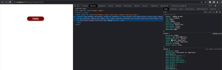
So that's kind of fun - but there's no CSS at all here. The browser will render a button using just its default
CSS rules and properties. Nothing special at all. We can add our own "custom.css" file as described
previously, and then add some CSS to it that can make our button a little more interesting. And right out of
the gate, we find ourselves in a situation where we need to use !important to override the default button
element's style.
button {
  min-width: 150px;
  border: 3px solid silver;
  background-color: maroon;
  color: white !important;
  font-size: 1.5rem !important;
  padding: 0.25rem;
  border-radius: 2rem;
}
Here's what it looks like in the browser. On the right, we can see our "custom.css" code being used, and also how the "color" and "font-size" properties are overriding the more specific "element.style" properties that the browser provides.
CSS Shenanigans.
While this is kind of annoying to have to deal with right out of the gate, most of the time we can get by
without it as we'll have other CSS files and other CSS selectors in play that make the browser defaults less
relevant. It does still pop up from time to time, often in the most inconvenient ways (<input> styling
for example) but for now all we're after is the ability to set styles directly in CSS using our own rules.
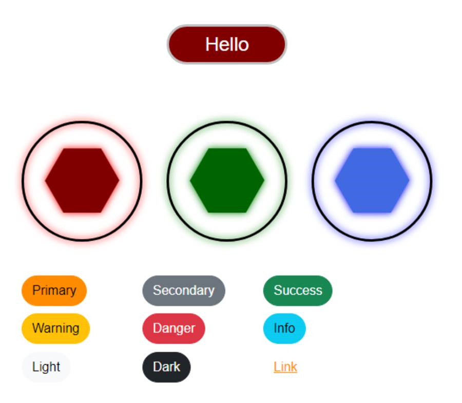
We
should also be mindful that CSS can indeed be quite a powerful tool in our toolbox, often used for a lot more
than just adjusting a few colors or adding a bit of rounding here and there (which is rather important all by
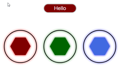
itself of course!). Here's an example where we have a few more elements to play with. Each hexagon has been
placed on the page using a separate TWebLabel component, where the hexagon itself is displayed just as a Unicode
character (#x2B23), and has been assigned its own HTML id attribute (via the ElementID property), as well as a
couple of classes, "Shape" and "Hexagon". Our CSS file has also been expanded to include the :hover
pseudo-class. These rules are applied whenever the mouse is hovering over an element. Altogether, including
a few comments, we now have this.
/* Buttons */

button {
  min-width: 150px;
  border: 3px solid silver;
  background-color: maroon;
  color: white !important;
  font-size: 1.5rem !important;
  padding: 0.25rem;
  border-radius: 2rem;
}
button:hover {
  background-color: #202020;
  cursor: pointer;
  border: 3px solid #101010;
}

/* Shapes */
.Shape {
  border: 3px solid black;
  border-radius: 50%;
  display: flex;
  justify-content: center;
  align-items: center;
  transition: transform 5s;
}
.Hexagon {
  font-size: 8rem;
  line-height: 1;
}

/* Elements */
#Hexagon1 {
  color: maroon;
  filter: drop-shadow(0px 0px 5px red);
}
#Hexagon1:hover {
  transform: rotate(-1080deg)
}

#Hexagon2 {
  color: darkgreen;
  filter: drop-shadow(0px 0px 5px green);
}
#Hexagon2:hover {
  transform: rotate(1080deg)
}

#Hexagon3 {
  color: royalblue;
  filter: drop-shadow(0px 0px 5px blue);
}
#Hexagon3:hover {
  transform: rotate(-1080deg)
}
Using the CSS transition property, which we covered in a post about animation here, we can get a more interactive experience. By setting a high rotation value (multiples of 360deg) we can get a kind of "wind-up" effect. Here's what it looks like.
CSS Example.
Just a few elements in, and we can already see that the amount of CSS involved, and its complexity, is quickly
growing. The use of classes like "Shape" and "Hexagon" is helpful in keeping the CSS somewhat organized, but
it is entirely up to us how that organization is managed. Anyone joining our project might not be familiar
with, or agreeable to, our particular choice of naming conventions or stylistic choices.
As the project grows, it would be helpful to have a standardized set of terms to use, as well as some consistency when assigning properties. For example, font-size could be defined using various units, including px or rem to start with, but potentially also mm, cm, in, or nearly a dozen others as well.
One way to approach this is to just use more classes in the application, and define them in the CSS file. For
example, we could define a class like "font-size-ENORMOUS" and then have a CSS rule like this:
.font-size-ENORMOUS {
  font-size: 8rem;
}
In our application, we would add this class to the ElementClassName list of classes for any component we like, and then not have to think about the CSS after it is initially created. As long as our projects use the same CSS file, and as long as this class is defined there, all is good. Over time, we might find ourselves with a pretty large and standardized set of CSS that we can use in multiple projects, allowing us to get up to speed quickly without having to define new CSS rules as we go through the development stages of our project.
Bootstrap.
This is, largely, what Bootstrap is all about. A very large collection of CSS classes (more than 1,700 - see the Bootstrap v5 list here or check out one of many "cheat sheets" here) that use a consistent set of conventions for things like colors and sizes of elements, often removing the need to fiddle with CSS at all, or at least greatly reducing the amount of CSS that we need to write ourselves.
When creating a new TMS WEB Core project, the "TMS WEB Bootstrap Application" template can be used to automatically add the necessary JavaScript and CSS libraries. It also initializes Forms and other components to have useful Bootstrap defaults. If there's a project that was created without using this template, Bootstrap can still be added using the "Manage JavaScript Libraries" function that is part of the Delphi IDE, or by adding CDN links to our Project.html file.
Generally, the CDN link will be more current, but there are usually only trivial changes
between various Bootstrap minor releases. The links for the JSDelivr CDN are provided directly on the Bootstrap
home page.
<!-- Bootstrap via JSDelivr -->
<link href="https://cdn.jsdelivr.net/npm/bootstrap@5.3.0-alpha3/dist/css/bootstrap.min.css" rel="stylesheet" integrity="sha384-KK94CHFLLe+nY2dmCWGMq91rCGa5gtU4mk92HdvYe+M/SXH301p5ILy+dN9+nJOZ" crossorigin="anonymous">
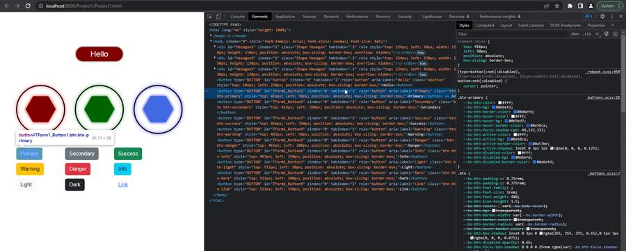
<script src="https://cdn.jsdelivr.net/npm/bootstrap@5.3.0-alpha3/dist/js/bootstrap.bundle.min.js" integrity="sha384-ENjdO4Dr2bkBIFxQpeoTz1HIcje39Wm4jDKdf19U8gI4ddQ3GYNS7NTKfAdVQSZe" crossorigin="anonymous"></script>Adding these to our current project doesn't change anything as we've not yet assigned any Bootstrap classes to any of our components. Let's add a TWebButton for each of the main Bootstrap colors. We can use the ElementClassName property to assign Bootstrap classes. For buttons, there's the "btn" class that adds styling for buttons generally, and then a separate class for the particular color that we want to use, like "btn-primary". The ElementClassName will then have "btn btn-primary" if we want to show the "primary" Bootstrap button. Here are all the default Bootstrap button colors.
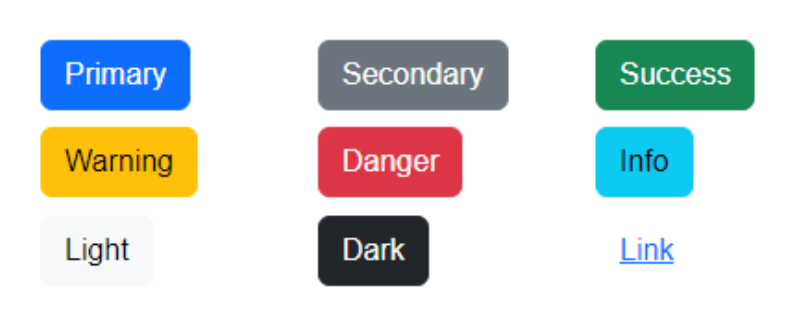
Bootstrap Buttons.
The buttons that are styled this way have a slightly different :hover color, and as can be seen above, use a
predefined set of other attributes like rounding, padding, and so on. Looking at the browser developer tools,
we can see that quite a few more CSS files are being used, like _reboot.scss and _buttons.scss. We'll cover
more about what an SCSS file is a little later. For now, all we're concerned about is that these extra files
are now part of our project, and we can make use of them without having to use CSS at all - just by assigning
classes to the ElementClassName properties of our components.
Bootstrap Behind the Scenes.
That works pretty well, but naturally, it comes at a cost. From the developer's perspective, adding classes
doesn't seem like such a difficult thing. And as Bootstrap is so wildly popular, any developer joining the
project may very well be familiar with its classes and conventions already. This can be a very good thing. But
how big is Bootstrap? How much potential dead weight are we adding to our app? Well, our app has now grown to around 338 KB. The
Bootstrap files we've added via the CDN come to around 313 KB. Which is quite a lot in terms of a JavaScript
library.
Some detractors are quick to point out that this is quite a large amount of overhead, particularly if you're serving up an application to millions of users. But as web applications can easily grow to several MB in size, whether this is a concern is entirely dependent on the individual project. And as the Bootstrap libraries don't change very often, there's a very high likelihood that these will be cached - reloading our page for example incurs a hit of less than 1 KB.
For perspective, visiting a few other pages while looking at the "Network" tab in the browser developer tools will show their size, both in terms of data transferred and the overall resource size. The TMS Software home page rings in at around 14 MB. The Apple home page is around 5 MB. Scrolling to the end of the CNN home page will hit somewhere close to 50 MB. And the Wikipedia page comes in at around 169 KB. Seems Wikipedia doesn't use Bootstrap!
Generally speaking, using Bootstrap, the extra download time is not likely to pose much of a problem. There are scenarios where it could, but for the vast majority of websites, this is not likely to be a deal-breaker. The time the browser takes to parse through all that CSS and JavaScript also has a cost, but this is also not likely to pose much of a problem. If there is such a need to reduce the overall initial download for a given project, this is a bit of a tradeoff to factor into that decision.
This is not unlike the scenario faced by jQuery developers. jQuery adds a bit more of a footprint to the project but brings along with it certain benefits. If those benefits aren't all that useful, then including it is pure overhead. In the case of jQuery, much of what it offered long ago is now available in pure JavaScript, so the benefits are steadily decreasing. In the case of Bootstrap, there isn't an equivalent change on the part of the browser, so the benefits aren't really decreasing. But these are trends that are slow to change, given the large number of installations.
Here's a comparison of the popularity of jQuery and Bootstrap (reference). They aren't really comparable in terms of features or functionality - they are very different things - but this
gives a clue to how popular they are, and how they will likely remain so for some time to come.
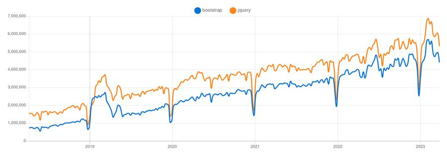
Bootstrap vs. jQuery NPM Downloads.
Getting at this kind of data can be a challenge, however, and like many statistics, the data can be misleading
or used to paint whatever picture the presenter wishes. Looking at JSDelivr data, we get a slightly different
picture.
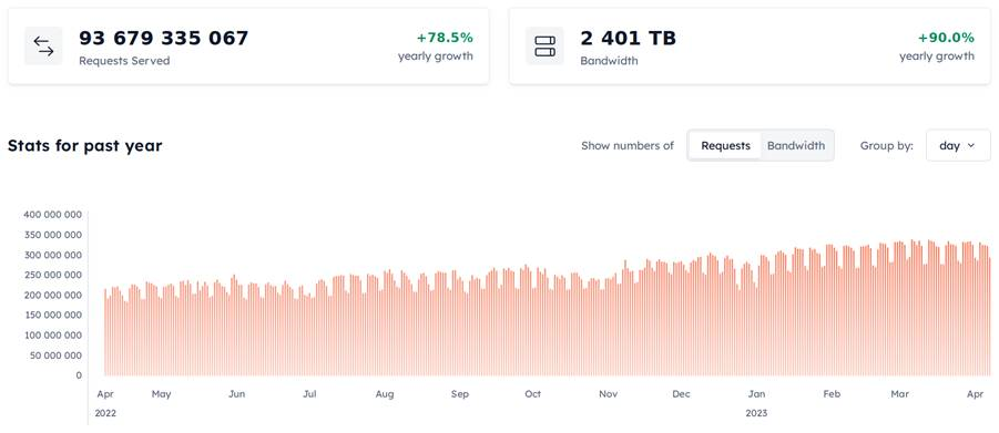
JSDelivr Bootstrap Statistics.
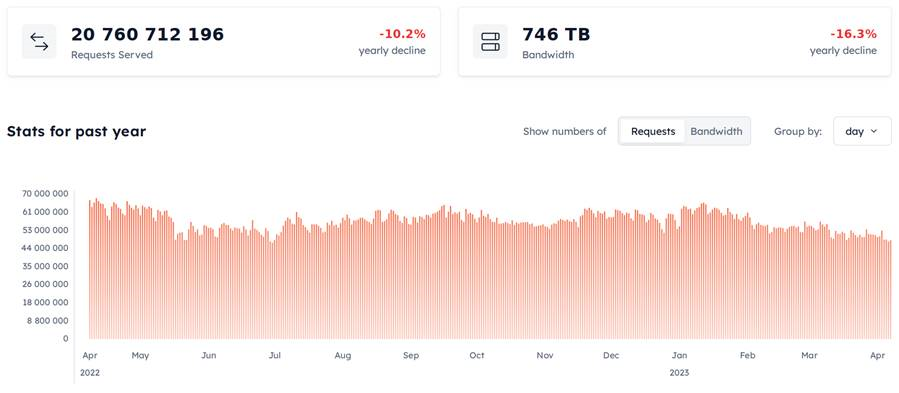
JSDelivr jQuery Statistics.
The 90% yearly growth of Bootstrap versus the 16% yearly decline of jQuery seems to support the idea that jQuery
is being phased out (very slowly of course) while Bootstrap might still be growing for some time. But, this
popularity has a bit of a dark side to it. If everyone everywhere is always using Bootstrap in their projects,
and they don't put any effort into customizing it, we'd likely be faced with a lot of websites that look like
one another. And that can be really boring. We aren't making the great leap away from ubiquitous Microsoft
Windows applications with their dated UI elements, only to land in a similarly stale world of Bootstrap UI
elements, after all. Fortunately, we have a few options here.
Customizing Bootstrap: CSS Overrides
Because Bootstrap is primarily just adding classes to the page for the browser to sort out, we can override the
Bootstrap styles by adding our own styles with the same names. Let's say that we wanted the "primary" color to
be orange instead of blue and that we'd like to increase the rounding of all the buttons. In our custom.css
file, we could add something like this.
/* Boostrap overrides */
.btn {
  border-radius: 2em;
}
.btn-primary {
  background-color: darkorange;
}
We could do the same to override any of the other properties. But it takes a bit of work to get everything right. For example, in this case, we've changed the background color of the button successfully, but there's still a blue border and it changes to blue when hovering over it. Not ideal.
To make this a little easier, we can
use CSS variables. These are values defined in CSS like any other properties, but that we can reference later
using the var() construct. So instead of changing the background-color property, we could instead change what
colors Bootstrap is using. Looking at the browser developer tools, we can see that there are quite a few that
need to be changed.
/* Boostrap overrides */
:root {
  --bs-border-radius: 2em;
}
.btn-primary {
    --bs-btn-bg: darkorange; /* #ff8c00 */
    --bs-btn-border-color: #80cc00;
    --bs-btn-hover-bg: orange; /* #ffa500 */
    --bs-btn-hover-border-color: #80a500;
    --bs-btn-active-bg: darkgreen;
    --bs-btn-active-border-color: #004000;
    --bs-btn-disabled-bg: #408c00;
    --bs-btn-disabled-border-color: #208c00;
}
While this works and gets us the results we're after, this isn't all that different than what we were doing
originally. Using variables has the potential to simplify this somewhat, but ultimately these are just used in
subsequent CSS rules to set property values that have similar names. At this level, there's close to a 1:1
relationship between CSS variables and the CSS properties they are applied to. So not a great situation,
but it works.
We could use CSS variables without Bootstrap, of course. It's as if Bootstrap has just given us a different
starting place for our CSS - perhaps obvious given the name. And this is perhaps the best way to frame the use of Bootstrap in a project - a lot
of the tedious work involved in defining classes and setting up defaults has been done already, leaving us to
use it as-is, or make changes as we see fit. The more extensive the changes, the more overrides we'll need and
the less useful Bootstrap is as a result. But Bootstrap comes with a lot of CSS, so it would take quite a lot
of customization work before replacing it was a sensible option.
Customizing Bootstrap: Themes
Another approach we could take, particularly if we just want to make cosmetic adjustments to Bootstrap, is to use a theme - essentially providing the same Bootstrap CSS but with a different set of default values for colors and so on. In previous versions of Bootstrap, a tool was provided to adjust the defaults directly via the Bootstrap website, where a different build of the Bootstrap CSS could then be downloaded and built with our own customizations. For Bootstrap v5, this feature hasn't (yet?) materialized on the Bootstrap website, but others have provided something equivalent. One such tool is Bootstrap.build. It starts out with the default styles for Bootstrap loaded up, showing examples of many components with these default styles applied. On the right, the many variables that Bootstrap uses can be changed.
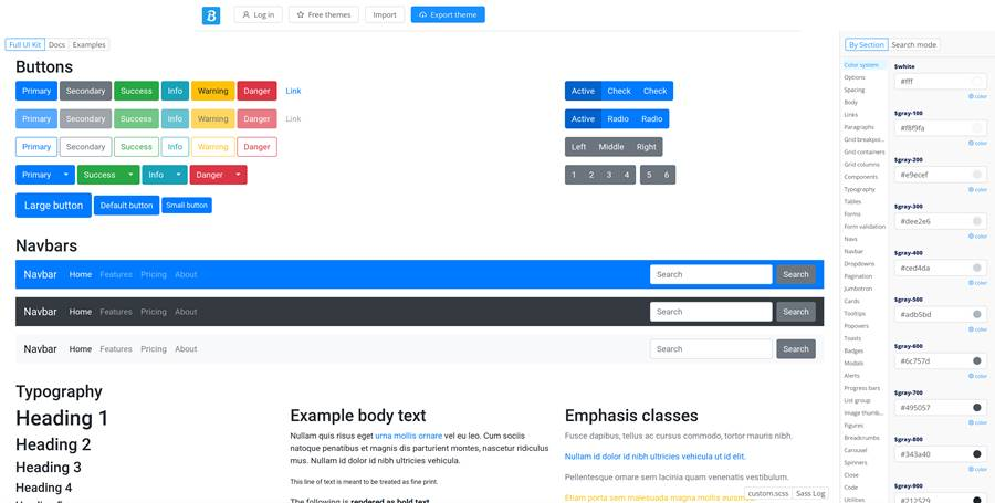
Bootstrap.build Interface.
If we want to change a few things, we can just update the options on the right, and the changes become
immediately visible on the page. Let's try changing our primary color to darkorange again. This option is
available in the first "Color system" option in the long list of options on the right. Scrolling down, we can
eventually find the $primary field, and fill in a value of "darkorange". If we wanted to change the default
border-radius, we can find that on the "components" page. Let's change that to 2rem for the regular, large, and
small variables. And with that, we're well on our way to having a more bespoke Boostrap-based style.
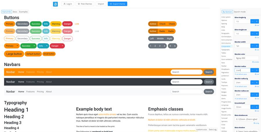
Customizing Bootstrap with Bootstrap.build.
After making changes, there is a link at the top of the page where an updated bootstrap.css or
bootstrap.min.css can be downloaded. This could be added to our TMS WEB Core project, replacing the Bootstrap
CSS from the CDN, and potentially our own custom.css file as well, if it only contained CSS that was related to
Bootstrap changes.
In addition, the Boostrap.build website offers a collection of other themes that can be used as the starting
point, rather than the Bootstrap default. So if you're looking for a bit of inspiration, perhaps that would be
a good place to start. Selecting a theme will load it into the same build tool, where you can then customize that
theme to your liking. And then download that bootstrap.css file for your own use.
While this is a very handy tool for making a few quick changes to Bootstrap defaults, it isn't immediately
clear what version of Bootstrap is being used, other than that it is Bootstrap v5. The tool is quite
comprehensive, offering easy access to many Bootstrap default values. There's even a custom SCSS file (more on
what SCSS is about in just a moment) at the bottom that can be populated with other CSS rules, beyond what is
included in Bootstrap. But what if you wanted to make more substantial changes to Bootstrap itself?
Customizing Bootstrap: Sass
Our final option for customizing Bootstrap involves the use of Sass. We touched briefly on this topic in this post related to how SCSS is used in the AdminLTE template. What's the difference between Sass and SCSS? Good question. There are plenty of websites that go over how both Sass and SCSS are supersets of CSS, including the Sass website itself. It basically boils down to having Sass files, with .sass extensions, and SCSS files, with .scss extensions. Sass files are a little less strict in terms of syntax, without the need for semicolons for example, whereas SCSS files look a lot more like CSS files with the same semicolons and brackets.
On the Bootstrap site, they label
everything as "Sass" in the documentation, but all the files provided are SCSS files. So a bit odd. Most of
the time, the projects we've been using tend to use .scss files and not .sass files, but there's the possibility
that we've just not looked at enough projects to run across one with .sass as yet.
Perhaps the most important thing to take away from this is that Sass and SCSS can read each others' syntax, and SCSS can use CSS syntax directly. And, after being run through the Sass pre-processor, the end result is always a straight CSS file that can be used in any browser. So, like the good folks that make Bootstrap, we'll just focus on .scss files.
In terms of customizing Bootstrap, then, they provide a complete set of .scss files
which we can download and build our own boostrap.css file from. We're going to follow along using these
instructions as a guide for building our own version. We'll start by creating an "scss" folder in our
project. Then, we can download and install the current version of Bootstrap by running the following command. This requires that Node.js
is already installed. Our project folder is called "CSS" and we're working within the scss folder.
c:\...\Projects\CSS\scss>npm install --prefix ./ bootstrap
When this completes (only takes a moment or two), there will be a node_modules folder, and within that, a
bootstrap folder, and within that, an scss folder. We can then add a "custom.scss" file inside our original scss folder at the root of our project, and use it to link to the Bootstrap SCSS files. This is a very slight variation from the Bootstrap
instructions. In our case, everything related to SCSS is tucked inside the scss folder to start with.
@import "../node_modules/bootstrap/scss/bootstrap";
Let's just build this as-is without changing anything. As we're assuming Node.js was already installed, we can
also install a couple of additional tools. We'll need Sass to compile the .scss files, and while we're at it,
also Minify, so we can, well, make a minified version of our new bootstrap.css file as well.
npm install -g sass
npm install -g minify
From here, we can just run a couple of commands to get what we need.
sass custom.scss:..\custom_bs.css
minify ..\custom_bs.css > ..\custom_bs.min.css
And that's it! We now have a new custom_bs.css and custom_bs.min.css file in the root of our project directory. We can then add these directly to our Delphi project (in the IDE via the Project Manager window). And we can update our Project.html file to look at this instead of the CDN version. Pretty fancy.
Let's
take it a step further and add a few changes to our custom.scss file that is in the scss folder. First, we can
define the changes we were making with the Bootstrap.build tool just by adding in the variable declarations
ahead of the @import. Then, because SCSS is fully compatible with plain CSS, we can add our
non-Bootstrap-related CSS code here as well, and then we'll just need one CSS file linked in our Project.html file.
Note that the original "button" CSS rules have been changed to use the "abutton" class instead, so as to not
interfere with the Bootstrap buttons we added after.
/* Bootstrap Overrides */

$primary: darkorange;
$border-radius: 2em;


/* Original Bootstrap */
@import "./node_modules/bootstrap/scss/bootstrap";


/* Buttons */
.abutton {
  min-width: 150px;
  border: 3px solid silver;
  background-color: maroon;
  color: white !important;
  font-size: 1.5rem !important;
  padding: 0.25rem;
  border-radius: 2rem;
}
.abutton:hover {
  background-color: #202020;
  cursor: pointer;
  border: 3px solid #101010;
}

/* Shapes */
.Shape {
  border: 3px solid black;
  border-radius: 50%;
  display: flex;
  justify-content: center;
  align-items: center;
  transition: transform 5s;
}
.Hexagon {
  font-size: 8rem;
  line-height: 1;
}

/* Elements */
#Hexagon1 {
  color: maroon;
  filter: drop-shadow(0px 0px 5px red);
}
#Hexagon1:hover {
  transform: rotate(-1080deg)
}

#Hexagon2 {
  color: darkgreen;
  filter: drop-shadow(0px 0px 5px green);
}
#Hexagon2:hover {
  transform: rotate(1080deg)
}

#Hexagon3 {
  color: royalblue;
  filter: drop-shadow(0px 0px 5px blue);
}
#Hexagon3:hover {
  transform: rotate(-1080deg)
}
The result is the same as we had before, but now with an orange primary button and more rounding - and we
didn't have to change all the other button states either - they are calculated automatically in the Bootstrap
SCSS code.
Custom Bootstrap CSS Installed.
Taking this another step further, what if we wanted to add another button style? Maybe a purple button with a
different name. Say, instead of "primary" or "secondary", perhaps we could add something like "special" or
"corporate". This is handled by the use of "maps" within our SCSS file. It is a bit trickier as we need to
include certain parts of their SCSS code before we can apply the map function. Doable, though. Here, we've
added both "special" and "corporate" colors. Once compiled, we can use things like "btn-special" and
"btn-corporate" just as we would with any other Bootstrap classes.
/* Bootstrap Overrides and custom color vars */

$primary: darkorange;
$border-radius: 2em;


/* Bootstrap Source */

@import "./node_modules/bootstrap/scss/functions";
@import "./node_modules/bootstrap/scss/variables";
@import "./node_modules/bootstrap/scss/mixins";


/* Add new Color Types */
$special: purple;
$corporate: #355e3b;
$custom-colors: (
  "special": $special,
  "corporate": $corporate
);
$theme-colors: map-merge($theme-colors, $custom-colors);


/* Import the rest of Bootstrap */
@import "./node_modules/bootstrap/scss/bootstrap";


/* custom bg colors not defined by the above */
.bg-special { background-color: var(--bs-special); }
.bg-corporate { background-color: var(--bs-corporate); }


/* The rest is our own CSS added here for convenience */


/* Buttons */
.abutton {
  min-width: 150px;
  border: 3px solid silver;
  background-color: maroon;
  color: white !important;
  font-size: 1.5rem !important;
  padding: 0.25rem;
  border-radius: 2rem;
}
.abutton:hover {
  background-color: #202020;
  cursor: pointer;
  border: 3px solid #101010;
}

/* Shapes */
.Shape {
  border: 3px solid black;
  border-radius: 50%;
  display: flex;
  justify-content: center;
  align-items: center;
  transition: transform 5s;
}
.Hexagon {
  font-size: 8rem;
  line-height: 1;
}

/* Elements */
#Hexagon1 {
  color: maroon;
  filter: drop-shadow(0px 0px 5px red);
}
#Hexagon1:hover {
  transform: rotate(-1080deg)
}

#Hexagon2 {
  color: darkgreen;
  filter: drop-shadow(0px 0px 5px green);
}
#Hexagon2:hover {
  transform: rotate(1080deg)
}

#Hexagon3 {
  color: royalblue;
  filter: drop-shadow(0px 0px 5px blue);
}
#Hexagon3:hover {
  transform: rotate(-1080deg)
}
The result, swapping the "light" and "dark" buttons for "special" and "corporate", is the following.
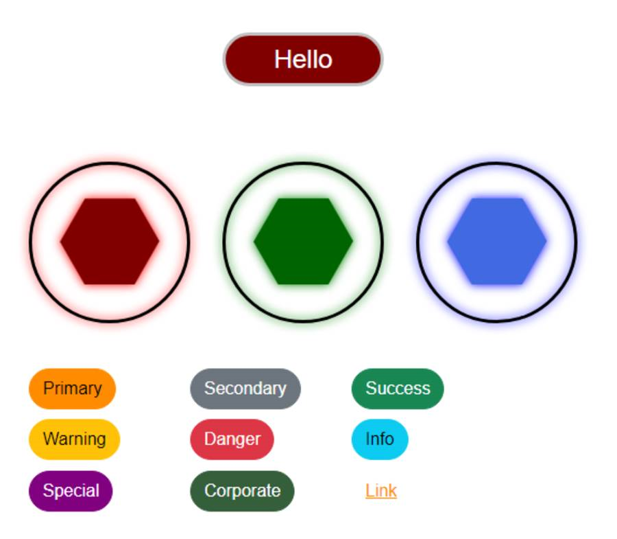
Custom Bootstrap Color Names.
There are of course many other things that we can do now that we have a custom Bootstrap file in place. And we
also get the benefit of SCSS as well, where we can do things like nest CSS classes, use a variety of functions
to calculate color values, and all kinds of other things. We could even go so far as to add a "post-build"
script to Delphi to call the Sass and Minify functions as part of the build process, to ensure that everything
is always up to date.
One caveat there, though. CSS normally will never generate an error - either the CSS
rules are applied or they're not. When using Sass to compile code into CSS, however, there most certainly can
be errors. So we would have to pay careful attention to the output of that post-build script, as any errors
generated would likely mean that the CSS would, at best, not be updated to the current version. On the other
hand, the npm command above that was used to install the Bootstrap Sass files could also be included in the
post-build script to ensure that the very latest version of Bootstrap was included in the project, just as if
the latest version was used for the CDN. Tradeoffs and options abound.
Tailwind CSS
So that all seems pretty great. Why would we ever consider using anything else? Well, it would be a tough sell, certainly. With so many experienced developers already familiar with Bootstrap, and with SCSS being a natural extension of CSS, there's a lot to like in this combination. However, one of the big drawbacks is that we're generating a rather large CSS file (very nearly 200 KB even when minified) and, for many projects, there's a good chance that the majority of that goes unused.
CSS, in general, has what might be considered a bit of a
problem in this area. CSS files and HTML files are, after all, quite separate from one another in most
respects. A given CSS file can be populated with whatever we like. It is normally up to the browser to pair
those rules with what is being shown on the page - rather late in the game to be making optimizations as far as
what CSS goes into the file in the first place. This might be a bit like buying a can of every available paint
color from the paint store when all we need are a few different colors to renovate our entire house. It's great
that we have access to everything, and it isn't that costly, but it can be a bit excessive for many projects, using up precious resources that could potentially be put to better use.
Tailwind CSS is, in most respects, a competitor to Bootstrap. And one of the things it does differently is how it gets involved in this HTML/CSS matching business a little bit earlier in the process - before they get sent to the browser. The goal of this is to reduce the CSS bits to only what is required for the project - ordering only the paint colors that we intend to use, using our home renovation metaphor. In fact, they claim that this approach can reduce the size of their CSS down to as little as 10 KB. This sounds remarkable, but there is a bit of work to get there, and also a bit of a shift in how CSS is used in the first place.
One approach Tailwind CSS takes in moving towards this goal is to make use of a great many more CSS classes
than even Bootstrap uses. Enough, in fact, that there is generally no need for CSS at all. We can kind of do
this already with Bootstrap in many cases. There are certainly projects in some of these blog posts where more
than a handful of Bootstrap classes are strung together and added to a single element, particularly when we get
into things like CSS flex, margins, padding, and so on. Taking this idea to its natural limits, Tailwind CSS adds even more
classes and focuses just on exactly that - removing the need to use CSS at all.
This may be problematic for some, however. First, there is an increased difficulty that arises from learning what all the classes are. In some development environments, tools like the code-completion function of the Delphi IDE may be brought to bear on this problem, though we can't do this in Delphi in this case. Otherwise, we're left to the Tailwind CSS documentation. Which is quite good. Of course, this isn't really much different than Bootstrap's learning curve.
Having all of these classes replace the need for CSS may also shift where the styling work is done. This "separation of concerns" may present a problem if the folks working on the project theme are different than those working on the other parts of the UI. Having everything separated out in a CSS file makes it easy to swap themes. This isn't necessarily the case if everything theme-related is now in the HTML for the project. In our TMS WEB Core projects, if we're not using an HTML template, then these classes are all embedded in the project JavaScript files - even more of a problem for this separation of concerns.
On the other hand, it can also be super-convenient, if this separation
of concerns is not a concern, to be able to adjust everything directly in code without having to resort to CSS
changes. Tailwind CSS also has a number of features that allow us to define themes via its configuration in HTML, providing an alternative to swapping CSS files. While it is a bit of a steeper learning curve, once Tailwind CSS is up and running, it offers a great deal more flexibility. Whether or not that is important to a project is something to consider earlier rather than later. Often, it may very well not be as important as we might otherwise expect.
To get started with Tailwind CSS - just using its classes - we can add a CDN script to our Project.html as we've typically been doing. In this case, there's actually just a JavaScript link - no CSS at all. This "Play CDN" is used for developer testing mostly, as it skips over all the other optimization steps we were discussing above, but gives us access to the many Tailwind CSS classes and gives us the opportunity to try out their approach without having to do much work at all.
Even so, this library is initially very small due to this being just the JavaScript mechanism that processes classes - not the CSS itself. However, this script does then trigger the download of the full Tailwind CSS code which, at around 350 KB, is nearly 75% larger than Bootstrap. To reiterate, then, we can use the Play CDN to try out Tailwind CSS, but if our ultimate goal is to be more efficient than Bootstrap, this is only an intermediate step. We'd have to follow through with the work to generate only the Tailwind CSS classes that we actually use. More on that in a moment.
   <!-- Tailwind CSS Play CDN -->
   <script src="https://cdn.tailwindcss.com"></script>
This script will look for the Tailwind CSS classes and also apply its own styling defaults. Note that we can include both Bootstrap and Tailwind CSS in the same project, but normally this would be something to aggressively avoid. Both due to the various class name collisions that arise and because often the point of Tailwind CSS is to remove the need for Bootstrap in the first place.
With collisions, for example, just adding the above to our project
has removed the background color from all the buttons, due to the fact that one of the Tailwind CSS defaults for buttons sets the background-color to transparent. We
can override this by adding !important to our own custom CSS for the top button, so it doesn't get changed by
Tailwind CSS. For the Bootstrap buttons, we can add an override for the Tailwind CSS by replacing its
"transparent" rule with one that just repeats the "--bs-btn-bg" value again, like this.
/* Block Tailwind CSS */
button.btn[type=button] {
  background-color: var(--bs-btn-bg);
}
If we were to seriously plan on using Tailwind CSS with Bootstrap or another large CSS library, another option is to configure Tailwind CSS with a "prefix" code like "tw-" so that all of its classes can be referenced explicitly, without collisions. This adds a bit of extra work if we had to add this to all of our classes in an existing Tailwind CSS project, but if we're just starting out with a new project, perhaps this is the better approach. We can add this to our Play CDN configuration by adding this to our Project.html file.
   <script>
     tailwind.config = { prefix: 'tw-' }
   </script>
So let's try out some Tailwind CSS classes. Let's add a few more TWebButton components to our form, and then customize them by adding classes to their ElementClassName properties.
- Tailwind 1
tw-px-3 tw-py-2 tw-text-base tw-bg-red-900 tw-text-slate-100 tw-rounded-full
- Tailwind 2
tw-px-3 tw-py-2 tw-text-base tw-bg-red-400 tw-text-slate-900 tw-rounded-full tw-border-slate-500 tw-border-2 hover:tw-bg-red-200 - Tailwind 3
tw-px-3 tw-py-2 tw-text-base  tw-bg-blue-400 tw-text-slate-900 tw-rounded-md
          -tw-skew-x-3 tw-border-slate-500 tw-border-2 hover:tw-bg-blue-200
All combined, we've got plain CSS, custom Bootstrap, and Tailwind CSS now displayed on the same page.
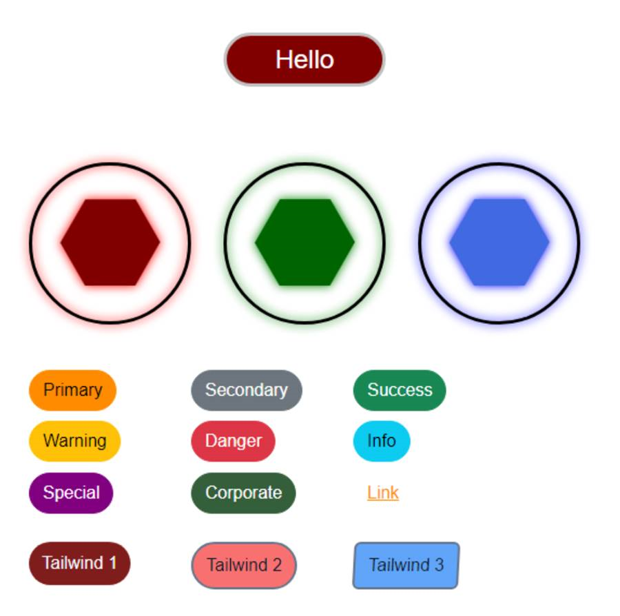
CSS Medley - Plain CSS, Custom Bootstrap, and Tailwind CSS.
That's pretty fun. Or a nightmare. Depending on whether you like this kind of thing. The last Tailwind 3
button gives a bit of insight as to how deep the Tailwind CSS classes go. In this example, we're doing all the
button-related things we were doing with the first two Tailwind buttons, but we've added a "skew" property,
where adding a "-" prefix reverses the skew direction. And colors. We're way beyond the usual Bootstrap color
classes here, with a huge array of predefined
colors readily available, and even the option to access RGB color values directly from a class.
Customizing Tailwind CSS is primarily handled through a "tailwind.config.js" script that can be added to a project, or declared directly in our Project.html, as we've done in the example above where we set the Tailwind CSS prefix value. And there's a lot that can be customized! Just looking at colors, we can define our own colors, naturally, but also aliases to existing colors.
If we want to use our own CSS in addition to
what Tailwind CSS covers, we can use something like their "@apply" function in our SCSS files to reference their
classes directly in our own code. We can also use this same mechanism to build our own classes to save having
to repeat so many of the same classes all the time. For example, we could create our own button class using
something like this (recall that CSS is case-sensitive, so btn <> Btn).
.Btn {
  @apply tw-px-3 tw-py-2 tw-text-base  tw-bg-blue-400 tw-text-slate-900 tw-rounded-md -tw-skew-x-3 tw-border-slate-500 tw-border-2 hover:tw-bg-blue-200;
}
We could then just use Btn as the class, keeping in mind that the SCSS file would have to be compiled - this
isn't possible with straight CSS, unfortunately. Note, however, that if we only had a handful of classes, we
could do this without using Bootstrap or Tailwind CSS. Just define our own classes with as many properties as
we like. Tradeoffs, as always, in terms of developer convenience.
This gets our foot in the door in terms of using Tailwind CSS in our projects. There's a lot more to explore though, particularly when it comes to a larger project where we'd want to build a local copy of our project that doesn't use the Tailwind CSS Play CDN approach. In this scenario, Tailwind CSS would be "built" in a way similar to what we've done for Bootstrap - using Node.js and various commands specific to Tailwind CSS - to build a local copy that also looks at our HTML and JavaScript files to figure out what classes we're actually using.
In a TMS WEB Core project, if we're not using HTML templates with Tailwind CSS classes directly, then
these classes will be embedded in the Project.js source code. Tailwind CSS has at least two different tools
(Tailwind CLI and PostCSS) to get at these classes, extracting those that we're using into a separate CSS file
that we can then include in our project. In theory, these could be incorporated into a Delphi post-build script
in the same way that we were considering doing for Bootstrap.
CSS Overload?
That's quite a lot of CSS content for one blog post. But we got through everything. Plain CSS. Bootstrap. Customized Bootstrap - three ways! SCSS. And even a bit of Tailwind CSS to round things out. Did we miss anything? Is there some aspect of CSS that you'd like to see covered in more detail? Or perhaps less detail? As always, any comments or questions are appreciated!
Follow Andrew on 𝕏 at @WebCoreAndMore or join our 𝕏 Web Core and More Community.
Andrew Simard
Bookmarks:

This blog post has received 6 comments.
 2. Thursday, April 20, 2023 at 9:22:53 PM
You are most welcome! Glad to hear that they are hitting the target.
2. Thursday, April 20, 2023 at 9:22:53 PM
You are most welcome! Glad to hear that they are hitting the target.
Andrew Simard
3. Saturday, April 22, 2023 at 7:14:53 PM
Never knew I could use Tailwind in my webcore projects. Once again thank you for taking out the time to show us what''s possible.
Ebikekeme Ere
4. Sunday, April 23, 2023 at 12:57:43 AM
Happy to help! There is a lot more to Tailwind than what is covered here. They even have a (paid) web component library as well.
Andrew Simard
5. Saturday, May 13, 2023 at 5:55:52 PM
Andrew, once again I''ve found your "basics" blog to be enlightening, thanks! I suspect that other Delphi users new to TMS Web Core would also welcome some simple examples showing the connection between a variety of controls in the Form Designer (besides buttons) and Bootstrap''s categories. I''m grateful for the link to the "cheat sheet", but I feel that I''m looking at hieroglyphics there and could use a Rosetta Stone or two.
Peterson Terry
6. Saturday, May 13, 2023 at 8:37:01 PM
Glad to be of help. Note carefully though that not all of these blog posts have been assigned the "Basics" moniker - Bootstrap vs. Tailwind is certainly not intended to be in that category. More "Basics" posts are on the way though, as they seem to elicit the most feedback! Understanding the linkage between components on a form and elements on a page is critically important when it comes to getting the most out of TMS WEB Core, so I will try and incorporate more examples of other components in future posts. Buttons have been chosen mostly because they are likely to be the most common components that we use, and as a result, where we have an opportunity to easily make bespoke interfaces.
Andrew Simard
All Blog Posts | Next Post | Previous Post
Terran Baylor