Blog
All Blog Posts | Next Post | Previous Post

 Delphi 11 high DPI? SVG has you covered!
Bookmarks:
Friday, October 22, 2021
Intro
On top of high DPI support at run-time, RAD Studio 11 Alexandria adds support for high DPI at design-time. This means applications/components will need to be modified to live up to this new requirement. This is a tedious job, but nevertheless, one that can be made easier when picking the right tools and libraries. High DPI has been around for quite some time now, impacting the way controls are designed. An important aspect when designing controls is image resources. Typically 16x16 or 24x24 PNG resources are used for non high DPI applications, when running your application on a high DPI screen however (for example at 150%), those sizes are too small. We would need to make sure that each resolution has its image resources available and also dynamically switches between those resources when the scale changes. To take away the need for adding multiple image resources for every possible scale, we designed and integrated SVG into our products and automatically made it available to you.
What is SVG?
SVG stands for Scalable Vector Graphics, an XML based graphic format completely built up from vectors. This basically means that an SVG file can be used without quality loss. Coming back to our requirements for high DPI, SVG fits in really nicely. No more numerous image resources for different screen resolutions. Designing various elements of your application based on SVG drastically reduces the time you need to make sure your application looks and feels nice on all various screen resolutions.
SVG also allows you to maintain only one resource. If your application is using one resource for multiple elements, for various sizes, changing only that single resource is sufficient to update your application, not having to worry about the behaviour and look and feel of that resource in all those different situations.
In practice
SVG support is available when installing one of the following 2 products.
After starting the IDE, SVG is already available. This is not only registered for our products, but also available in default VCL controls. We start by adding VCL.TMSFNCTypes or AdvTypes unit (depending on the installed product). The unit will register the SVG type at runtime. At designtime, the package already registers SVG support. For this sample, we take 2 TButtons, one with a PNG and one with an SVG image resource. We drop a TVirtualImageList and a TTMSFNCSVGImageCollection on the form. The TTMSFNCSVGImageCollection can be used to add both image resources. After feeding the TTMSFNCSVGImageCollection to the TVirtualImageList, we are ready to connect our buttons.
After connecting everything together, filling up the TVirtualImageList, the buttons look similar, because the resolution of the PNG is 24x24 and no scaling is applied.
TVirtualImageList has the option to scale images, so when we change the resolution from 28x28 to 128x128 making our buttons larger, we see the quality of the PNG is no longer good. The resolution of the SVG however, nicely scales to the new requested size.
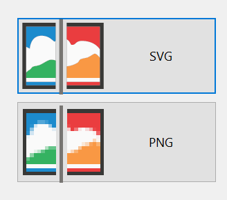
For PNG, this means we would need to create a TVirtualImageList for different resolutions, managing each list, detecting which scale is applied and applying the correct TVirtualImageList. While the SVG stays nice and sharp, and only one TVirtualImageList is required independent of the initial resolution, or the resolution of the screen. Additionally, using SVGs also immediately provides a clean and crisp look and feel in designtime.
Want to know more?
More information on SVG, the supported SVG features as well as the enhancements we made to our SVG engine are available in the following blog posts.
Pieter Scheldeman
Bookmarks:

This blog post has received 2 comments.
 2. Monday, November 8, 2021 at 10:33:35 PM
At this moment there is not a setting.
2. Monday, November 8, 2021 at 10:33:35 PM
At this moment there is not a setting.We reflect on adding this in a future edition.
Bruno Fierens
All Blog Posts | Next Post | Previous Post
The reason is that if I use Metarial Design Icons, then I have only blach icons, but would be very useful if the button would have a green Ok and a red Cancel icon.
If there is already a way to do it, then teach me, please :)
Gomezel Dino