Blog
All Blog Posts | Next Post | Previous Post

 Extend TMS WEB Core with JS Libraries with Andrew:
Shoelace Web Components
Bookmarks:
Tuesday, January 24, 2023

TMS
WEB Core developers in particular have an assortment of components to choose from directly within the Delphi
IDE's Component Palette. Generic components for web UI development are sometimes a little less capable than we'd
like, given that the browser itself tends to play an out-sized supporting role, introducing inconsistencies and
perhaps with fewer features, particularly when targeting multiple platforms (aka browsers) from the
same code base. To help with that, we're going to have a look at Shoelace,
an open-source web component library.
Motivation.
Who doesn't like free components? In the case of Shoelace, these are web components that are fully customizable via CSS, and work in all the places we'd like them to work. There isn't a huge array, and, to be honest, some of them we already have pretty great equivalents for already, within TMS WEB Core or many of the FNC products. However there are a few novel components that might be of interest in certain settings. A few extra tools for our toolbox!
Getting Started.
Shoelace can be included in our project just like any other JavaScript library, using a link in our Project.html file or by using the Manage JavaScript Libraries feature of the Delphi IDE. The usual CDN approach works fine here, or the library files can be downloaded and included directly in your project. Here's what we've got for the CDN approach. <link rel="stylesheet" href="https://cdn.jsdelivr.net/npm/@shoelace-style/shoelace@2.0.0-beta.88/dist/themes/light.css" />
<script type="module" src="https://cdn.jsdelivr.net/npm/@shoelace-style/shoelace@2.0.0-beta.88/dist/shoelace.js"></script>Note that if you only need certain components, they can be imported the same way individually as well. Any related dependencies are also loaded automatically using this approach.
<script type="module" src="https://cdn.jsdelivr.net/npm/@shoelace-style/shoelace@2.0.0-beta.88/dist/components/button/button.js"></script>
Once the Shoelace library and its related CSS file have been loaded, it's immediately ready for use. As there isn't a set of components created for TMS WEB Core, using Shoelace web components generally involves dropping a TWebHTMLDiv component on the form and then using the HTML property to reference the Shoelace component. To display a Shoelace button, for example, we could add this to the HTML property.
<sl-button size="large" variant="success">Success !</sl-button>
The result is a button with a bit of styling, ready for use.
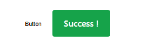
Shoelace Button.
To implement an event handler, the standard JavaScript addEventListener approach is employed. Here, we'll call a Delphi function whenever this button is clicked. There are lots of ways to do this, but let's assign an HTML id to the button and then in WebFormCreate, we can define what function to call. Our button (added to the TWebHTMLDiv component's HTML property as above) now looks like this.
<sl-button id="mybutton" size="large" variant="success">Success !</sl-button>
And then in WebFormCreate we add this bit of code.
  asm
   mybutton.addEventListener("click", event => {
     this.MyButtonClick(event);
    });
  end;
To test it out, we'll need to set up MyButtonClick, perhaps like the following.
procedure TForm1.MyButtonClick(event: JSValue);
var
  event_id: String;
begin
  event_id := 'undefined';
  asm
    event_id = event.target.id;
  end;
  ShowMessage('Button was clicked: '+event_id);
end;
Here, we're passing the JavaScript "event" object to our Delphi function, with a type of JSValue - sort of like a variant type. If we were to use the same event handler for many buttons, we could then look inside this event object to see what button triggered the event. This isn't all that different from Delphi's typical "Sender" parameter.
For example, "event.target.id" would return the HTML id element. In this case, it is "mybutton". If MyButtonClick only needs to handle one specific button, then all that event stuff can be left out and you can get by just fine with just the call to ShowMessage, without even any need to pass it a parameter in the first place.
One more thing before moving on. For this example, we were able to use "this.MyButtonClick()" to reference a Delphi function from within JavaScript. This typically works pretty well, particularly when you're working within just one form and when your events aren't very complicated. Sometimes, though, this is not so easy. Some JavaScript event handlers will replace "this" with whatever object triggered the event, removing our link to the Delphi Form. This would have been the case here if we had set up the event handler to use a traditional function expression instead of an arrow function expression (=>), which deliberately does not reassign the value for "this".
In the former case, you can use "pas.Unit1.Form1.MyButtonClick()" as the long-hand way of writing the same thing as "this", updating it of course to match your Unit and Form names, respectively. This also makes it a little more obvious when you're dealing with multiple forms.You can also assign the name of your form to a variable if you find you're doing "this" a lot. Or you can even define a variable to point at the Delphi function directly. For example, the following variations each produce an equivalent result, and will not be impacted by the reassignment of "this" by an event handler. In JavaScript, functions can be passed around in variables just like anything else.
  asm
   var here = pas.Unit1.Form1;
   var MBC = pas.Unit1.Form1.MyButtonClick;
   var thisMBC = here.MyButtonClick;
   mybutton.addEventListener("click", function(event) {
      MBC(event);
      here.MyButtonClick(event);  // does the same thing
      thisMBC(event);  // does the same thing
    });
  end;
That might all sound overly complicated, but not something to be concerned about once you've done it a few times. Just a bit of extra information if you find that your JavaScript code suddenly can't find the Delphi elements it was otherwise using without incident.
For even more fun, a problem can also arise in the Delphi function being called, where it 'forgets' what form it is on, even if it contains no JavaScript at all. Meaning that you have to prefix "Form1." to anything referencing a form element within that method. Just something else to file away in case it comes up later.
More Wiring.
Shoelace of course comes with more than just buttons. In fact, there are more than 40 web components included in the library, along with a handful of utility functions and other bits to help smooth out some of the rougher spots. We're not going to cover all of them, just a few of the more interesting ones. But there are a few commonalities to go over before we get to them.
First, Shoelace uses something it calls Slots to combine its web components together. Each component may have a number of such slots available. The button component, for example, has a "prefix" and a "suffix" slot where you can (optionally) connect another web component, such as perhaps a Shoelace "icon" component. This mechanism allows you to weave together a more complex tapestry of UI elements.
Next, depending on the component chosen, there may be a number of Events fired as the user interacts with the component. These can be wired up using the same "addEventListener" mechanism as we've done with the "click" event for a button. Typically, the "sl-focus" and "sl-blur" events are available, for when a component gains or loses focus, respectively. Most of these are prefixed with "sl-" so as not to introduce conflicts with other browser-generated events.
Each component may have a number of different Methods available. These are used to programmatically trigger events or other actions without user intervention, often mirroring to some degree the events that are available. For example, the button component has click(), focus(), and blur() methods corresponding to the events we've already covered.
Perhaps the most interesting, there is usually an array of Attributes and Properties that can be set for each web component. These are what you'd normally expect to see in the Delphi IDE Property Inspector. We used some of these in our button example above, like the "size" and "variant" attributes.
In terms of terminology, generally, HTML uses "tags" as the main descriptor for an element, like <button>, <h1>, <div>, <span> and so on. Shoelace uses tags that are prefixed with "sl-" so they don't conflict with regular HTML tags.
HTML "attributes" are the additional descriptors added to an element, like "class", "style", "width" and so on, and may be standalone terms, like "disabled" or may have values associated with them, like "width=300".
CSS properties usually refer to the various things that can be set in the HTML style attribute. For example, <button style="width:500px;">.
These can all end up mashed together, with attributes sometimes being converted into CSS properties, that sort of thing. This is what happens here when you assign a value to something like "variant". This ultimately gets converted into CSS before being rendered. Note that in some cases, Shoelace requires that these are set via JavaScript rather than just plunked into a bit of HTML, as we'll see in the color picker example below.
This brings us to the last bit of Shoelace that we're interested in - customizing CSS using CSS Parts. This is a little different than the straight-up CSS overrides we're perhaps accustomed to. Instead, each component exposes various "parts" that can then have custom CSS applied. This makes things a little more complicated, but behind the scenes, Shoelace uses a Shadow DOM to go about its business, so the usual approach won't work.
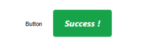
We can still do all the customization we'd like, we just need to add extra CSS qualifiers for the part of the component we're interested in changing. For our button example, let's say we wanted to override the label style. We could add a class to identify the button, and then add a bit more to indicate that we're changing the label "part". This can all be set in the TWebHTMLDiv component's HTML property as follows, or more likely added to a custom CSS file for the project overall, particularly if we want to apply the same CSS to multiple elements on the page.
<sl-button id="mybutton" class="StrongButton" size="large" variant="success">Success !</sl-button>

<style>
.StrongButton::part(label) {
  font-weight: 700;
  font-style: oblique;
}
</style>
This gets us a slightly altered button.
Using CSS Parts.
The idea behind using the Shadow DOM and CSS Parts is to help encapsulate the component so that changes to it don't impact anything else on the page, and perhaps more importantly so that nothing on the page impacts the component.
This is not a new thing, but not something we've normally had to worry about too much with the work we've done so far. There have long been certain HTML tags that work in a similar way, such as the <video> tag that magically draws all kinds of things on the page while not showing anything at all in the HTML code internally. In the case of Shoelace web components, the underlying HTML is actually readily visible.
There's a lot more to this Shadow DOM mechanism, but not something we need to worry about for the time being. We just need to know how to apply the CSS to the component, and in this case, each web component in Shoelace provides a list of parts that we can use to achieve the same kinds of customizations that we could without a Shadow Dom.
With all that out of the way, let's have a look at some of the more interesting components.
Switch.
One of the simpler components, a switch just shows a binary value and allows the user to change it. Nothing too fancy. One benefit of this over the standard HTML variant is that clicking on the label also flips the switch. Might seem like a small thing, but it's the little touches that help make a difference. If we wanted a comically large switch, we could implement it by doing something like this.
<sl-switch id="myswitch" class="bigswitches" style="--width: 100px; --height: 50px; --thumb-size: 75px">Now THAT is a Switch!</sl-switch>

<style>
.bigswitches::part(label) {
  padding-left: 15px;
}
</style>
Note that the thumb is so large that we had to move the label over a little bit so that it didn't get covered up. We can also change certain style aspects of the component when they've been exposed, as is the case here with the --width, --height, and --thumb-size properties.
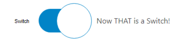
Shoelace Switch.
This makes it pretty easy to adjust everything just how we'd like. The CSS "parts" exposed include the "control",
"thumb", and "label" so we can adjust those individually. We did this above for the label. Let's change the
thumb to have a thicker ring with a bit of a shadow effect, and maybe reduce the border-radius of the control so
it is more rectangular rather than perfectly round.
<sl-switch id="myswitch" class="bigswitches" style="--width: 100px; --height: 50px; --thumb-size: 75px">Now THAT is a Switch!</sl-switch>

<style>
.bigswitches::part(label) {
  padding-left: 15px;
}
.bigswitches::part(thumb) {
  filter: drop-shadow(0px 0px 2px black);
  border-width: 5px;
}
.bigswitches::part(control) {
  border-radius: 15px;
}
</style>
This gets us the following.
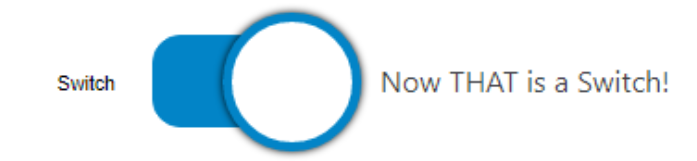
Fancy Shoelace Switch.
Plenty of other customizations can also be made with respect to colors and so on, using this same approach. As far as events and methods are concerned, this is a fairly simple control, much like the button, so the same mechanisms work. In this case, instead of using the "click" event for the "addEventListener" call, you can use "sl-change" and then pass the state of the switch to a Delphi method.
  asm
    myswitch.addEventListener("sl-change", event => {
      this.MySwitchChanged(event.target.checked);
    });
  end;
Then, in Delphi, we can just worry about the state of the switch and not be concerned about the rest of the event.
procedure TForm1.MySwitchChanged(switchstate: Boolean);
begin
  if switchstate
  then ShowMessage('Switch is ON')
  else ShowMessage('Switch is OFF');
end;
Note that the event is called before the switch is updated on the page. Less of an issue when not using ShowMessage of course.
Color Picker.
There's no shortage of JavaScript color pickers, and you might even find a few in your own Component Palette if you were to go looking (I see six in mine!). This is one of those components where you might want to try a few out before settling on one to use, particularly if you have any special requirements, like wanting to provide a default set of colors or providing access to different color spaces (rgb, hsl, etc).For our example, let's say we want to have the color picker already visible on the form, rather than a popup. And we want to enable all of the available features to show off what it can do. Let's start with this.
<sl-color-picker id="mycolorpicker" inline opacity uppercase format="rgb" value="maroon"></sl-colorpicker>
Which gets us a pretty functional color picker right out of the gate.
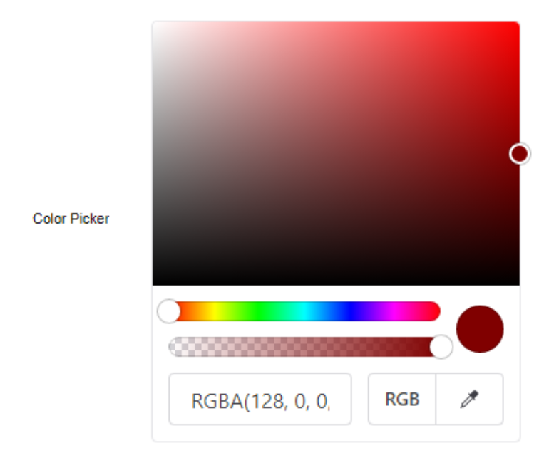
Shoelace 'inline' Color Picker.
Not too bad to start with. Let's customize it a bit further. First, let's make it a bit bigger. This helps give us a wider text entry field, but also a bit more room to work with. Let's make the sliders bigger, a little less circular, and add a bit of style to the overall element.
<sl-color-picker
   id="mycolorpicker"
  class="fancyslider"
  style="
    --grid-height: 200px;
    --grid-width: 400px;
    --slider-height:30px;
    --slider-handle-size: 40px;
  "
   inline
  opacity
  uppercase
  format="rgb"
  value="maroon"
></sl-colorpicker>

<style>
.fancyslider::part(base) {
  border: 2px solid royalblue;
  border-radius: 12px;
  background-color: #F0F0FF80;
}
.fancyslider::part(grid) {
  border-top-left-radius: 11px;
  border-top-right-radius: 11px;
}
.fancyslider::part(hue-slider) {
  margin-left: 20px;
  margin-right: 40px;
  margin-bottom: 20px;
  border-radius: 10px;
}
.fancyslider::part(opacity-slider) {
  margin-left: 20px;
  margin-right: 40px;
  margin-top: 20px;
  border-radius: 10px;
}
.fancyslider::part(slider-handle) {
box-shadow: rgb(0 0 0 / 25%) 0px 0px 0px 4px;
}
.fancyslider::part(preview) {
  border-radius: 15px;
  width: 70px;
  height: 70px;
  margin-right: 10px;
}
.fancyslider::part(input) {
  border: 1px solid royalblue;
  border-radius: 10px;
--sl-input-border-radius-medium: 10px;
}
.fancyslider::part(format-button) {
  border: 1px solid royalblue;
  border-top-left-radius: 10px;
  border-bottom-left-radius: 10px;
}
.fancyslider::part(eye-dropper-button) {
  border: 1px solid royalblue;
  border-top-right-radius: 10px;
  border-bottom-right-radius: 10px;
}
.fancyslider::part(format-button__base) {
  border-top-left-radius:10px;
  border-bottom-left-radius:10px;
}
.fancyslider::part(eye-dropper-button__base) {
  border-top-right-radius: 10px;
  border-bottom-right-radius: 10px;
}
</style>
That gets us here.
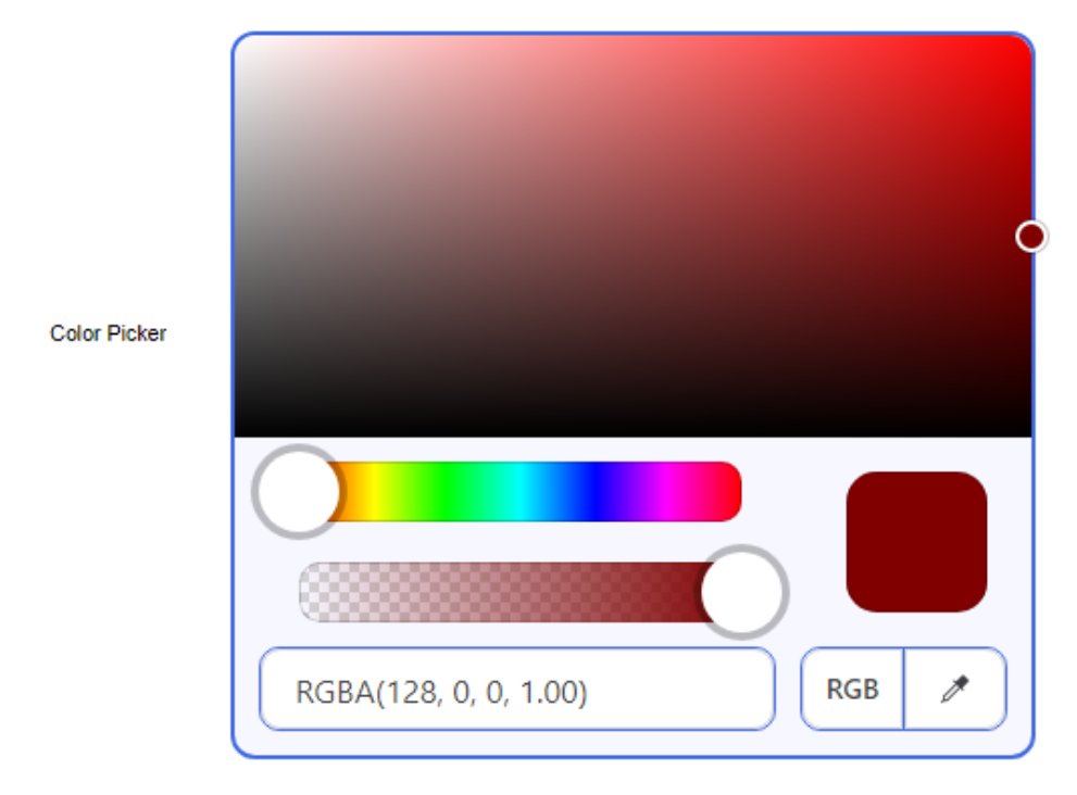
Styled Shoelace Color Picker.
Next up, we like swatches. Lots and lots of swatches. And, we'd also like to know what the names of the swatches are, if possible. Not all colors have names that are understood by CSS, but there are quite a few that are. Let's set up a grid of organized colors and replace those with names where we know what they are, and then add in some extras at the bottom to fill it out.
Colors can be added via HTML using a semicolon-separated list of color values, or via JavaScript by sending an array of color values. Let's go with the JavaScript version here as it is a little easier to edit, if nothing else.
 asm
    mycolorpicker.swatches = [
      '#202020','#404040','#606060','gray',  '#A0A0A0','silver', '#E0E0E0', 'white',
      '#200000','#400000','#600000','maroon','#A00000','#C00000','#E00000', 'red',
      '#002000','#004000','#006000','green', '#00A000','#00C000','#00E000', 'lime',
      '#000020','#000040','#000060','navy',  '#0000A0','#0000C0','#0000E0', 'blue',
      '#200020','#400040','#600060','purple','#A000A0','#C000C0','#E000E0', 'fuchsia',
      '#202000','#404000','#606000','olive', '#A0A000','#C0C000','#E0E000', 'yellow',
      '#002020','#004040','#006060','teal',  '#00A0A0','#00C0C0','#00E0E0', 'aqua',
      'black',  'gold',   'pink',   'orange','tomato', 'brown', 'deepskyblue','royalblue'
    ];
  end;
Finally for this component, to get the names to display via a tooltip we can use another Shoelace web component - the Tooltip! This is a bit tricky though. A tooltip is designed to show on hover over the component it is wrapped around. But the components are part of the Shoelace colorpicker. So we have to do a bit of work to replace the swatch in the colorpicker (which happens to be in the Shadow Dom) with one that is wrapped with the tooltip component.
To make things a little more difficult again, the Shadow DOM isn't immediately available. Here, we just wait one second before we try and attempt this. Ideally, we'd wait for an event of some kind to tell us that it is ready, but here it isn't so much of an issue as it is just a tooltip we're dealing with.
  // Add Tooltips
  asm
    setTimeout(function() {
      var picker = mycolorpicker.shadowRoot;
      var swatches = picker.querySelectorAll('.color-picker__swatch');
      swatches.forEach(swatch => {
        var parent = swatch.parentNode;
        var tooltip = document.createElement('sl-tooltip');
        tooltip.content = swatch.ariaLabel;
        parent.replaceChild(tooltip, swatch);
        tooltip.appendChild(swatch);
      })
    },1000);
  end;
And with that, we've got our completed Color Picker.
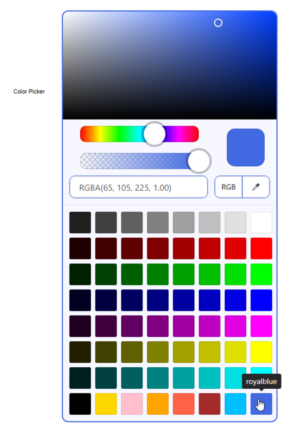
Fancy Color Picker.
To get the selected value, we can use the same "sl_change" event as previously. The color chosen can also be returned in a number of different formats. As we've enabled opacity for this color picker, we might as well return a HEXA value.
  asm
    mycolorpicker.addEventListener("sl-change", event => {
      this.MyColorPickerChanged(event.target.getFormattedValue('hexa'));
    });
  end;
And then in our Delphi function, we can just display this value.
procedure TForm1.MyColorPickerChanged(hexacolor: String);
begin
  ColorLabel.Caption := hexacolor;
end;
While this covers quite a bit of what one might use a color picker for, it likely won't fit every need. Some people prefer using color wheels, for example, or other variations on how sliders are used. Another popular approach involves showing separate sliders for each color component, whether that is RGB, HSV, or something else. So while this color picker works pretty well, and offers a good level of customization of what it offers, there may be others better suited to your needs. But that's kind of the point of web components - mix and match all you like until you get to where you need to be.
Image Comparer.
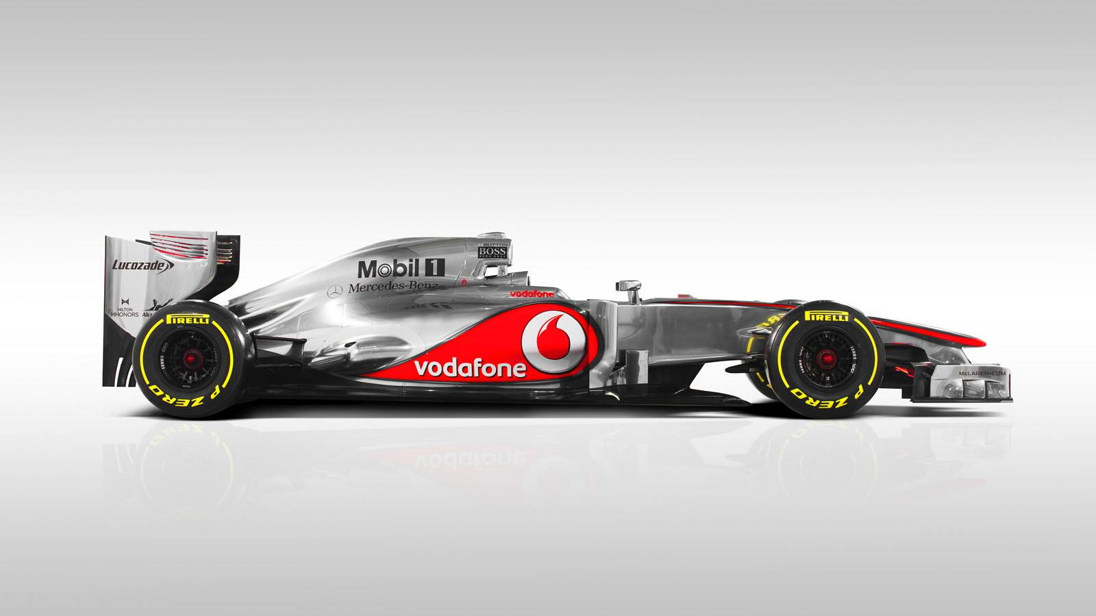
Let's have a look at one more component. This one caught my attention as I don't recall seeing something like this in component form previously. You've probably seen this kind of thing a few times. Most often, I see this sort of tool being used to show a comparison of before/after photos after some kind of horrific natural disaster. Like showing a community before and after a flood. Or a satellite picture before and after a volcanic eruption. The slider in the middle allows you to show more or less of either image.
Rather than natural disasters, let's take a look at Formula 1 cars instead. Here's a nice photo of a McLaren car from 2012 and one from 2022.
Setting up the Image Comparer couldn't be much simpler.
<sl-image-comparer class="ic"  position="50">
  <img
    slot="after"
    src="https://cimg1.ibsrv.net/ibimg/hgm/1600x900-1/100/380/mclaren-mp4-27-2012-formula-1-race-car_100380113.jpg"
    style="border-top-left-radius: 18px; border-bottom-left-radius: 18px;"
   />
  <img
    slot="before"
    src="https://media-cdn.mclaren.com/media/images/galleries/2022_MCL_LAUNCH-MCL36-SAFE_LN_VELO_Side_v1_WEBSITE_RELEASE_600x620.jpg"
    style="border-top-right-radius: 18px; border-bottom-right-radius: 18px;"
  />
</sl-image-comparer>

<style>
.ic {
  overflow: hidden;
  border-radius:20px;
  border: 2px solid gray;
}
</style>
And this gets us to our comparison. Moving the slider back and forth will show more or less of either image. Don't try it here though - this is just a screenshot from the sample project! One of the key differences between these two cars, for example, is the addition of the "halo" - the safety ring added to protect the driver's head - which was introduced to all F1 cars in 2018.
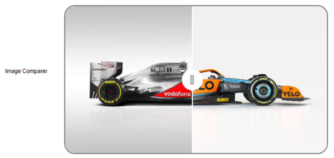
Shoelace Image Comparer.
A little extra care is taken for the rounded corners and the border, but other than that, this mostly just involves dropping a pair of images into the component, and the rest of the work is done for us. The size of the image is scaled automatically to fit the width of the TWebHTMLDiv component that it is set inside. There are a small number of things that can be changed - such as the icon on the slider, but really this is doing exactly what it is supposed to do with minimal effort on the part of the developer. Ideal!
More to Explore.
The Shoelace web component library has dozens more components to explore but for the most part, they follow the same patterns that we've seen in the components we've looked at here. There are many other bits and pieces to explore, including all kinds of support for icons and icon libraries, QR codes, many different kinds of HTML element replacements, animations, and more. Hopefully, this post has given you a bit of a taste of how easy it is to use these components in your TMS WEB Core projects.
We'll be covering Tailwind in an upcoming TMS Software Blog Post, which also includes many of these kinds of
components. And of course, there are many simple components included in Bootstrap as well. Is there another web
component library that you'd like to see covered? Leave a comment below and we'll add it to the list.
Example Project Download
Example Project on GitHub
Follow Andrew on 𝕏 at @WebCoreAndMore or join our 𝕏 Web Core and More Community.
Andrew Simard
Bookmarks:

This blog post has received 2 comments.
 2. Tuesday, January 24, 2023 at 7:24:48 PM
The GitHub link has been fixed. Working on the other one. The DevExtreme libraries have a few interesting components as well, and of course DevExpress is likely familiar to many Delphi developers. Will add it to the list!
2. Tuesday, January 24, 2023 at 7:24:48 PM
The GitHub link has been fixed. Working on the other one. The DevExtreme libraries have a few interesting components as well, and of course DevExpress is likely familiar to many Delphi developers. Will add it to the list!
Andrew Simard
All Blog Posts | Next Post | Previous Post
Nice article. I find I''m now more-and-more just using bootstrap and DevEx DevExtreme libraries.
The links don''t work.
Regards,
Ken
Randall Ken