Blog
All Blog Posts | Next Post | Previous Post

 Custom control development with TMS WEB Core for Visual Studio Code, an intern reports
Bookmarks:
Wednesday, May 26, 2021

At tmssoftware.com we love to have interns. I believe it is a fantastic experience to learn young aspiring software developers about Delphi, its eco-system, its amazing productivity and at the same time, absorb a lot of energy, get new fresh ideas and get to know what drives and motivates the next generation of software developers.
So, also this school year, we had 2 interns learning all about Delphi, TMS WEB Core, Object Pascal, components and much more here at tmssoftware.com.
Today, we want to give the word to our intern, and very soon colleague, Bradley who did a lot of stunning work this school year and tells in his first blog post about building his first custom control for TMS WEB Core. Nothing but an amazing and exciting story! So, with pleasure, I give the word to Bradley:
Today, we want to give the word to our intern, and very soon colleague, Bradley who did a lot of stunning work this school year and tells in his first blog post about building his first custom control for TMS WEB Core. Nothing but an amazing and exciting story! So, with pleasure, I give the word to Bradley:
A first custom web control
Having only one year experience using Delphi and TMS WEB Core, I was assigned the (at first sight) daunting task of developing my first ever custom web control, namely a chat box control. I had only been developing web applications since I joined tmssoftware.com as an intern, so clearly writing a component was something completely new. Using the available documentation and the experience of my mentor Bruno I quickly obtained the necessary skills for developing a TMS WEB Core custom control, the TWebChatBox control.
First steps
To gain some experience, I first developed another very small control, a custom toggle button control to switch a web application between full-screen and normal mode. I went for developing the custom control directly from TMS WEB Core for Visual Studio Code because I just feel more comfortable for web projects to use this IDE. I had the "privilege" to use first the alpha and then the beta version of TMS WEB Core for Visual Studio Code v1.3 (released yesterday btw) as this introduced component package support. Using the new package support for installing custom controls made it very easy to test the control, also at design-time. The development of this first small control allowed me to get used to the concept of custom controls as well as the steps involved to get it installed in the IDE.
Starting the chatbox implementation
After I was comfortable enough with the principle of custom controls. I’ve started building the chat box component. As there were a ton of features on the requirements list, I had actually no idea where to start. I’ve focused first of all on a working way of sending/receiving messages. When I had that going, I started focusing on adding a basic design, followed up by adding the necessary properties for manipulating said chat box.
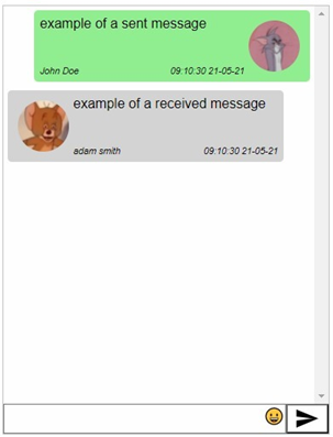
I think implementing collections as a way of managing messages was the only thing I really struggled with. Having never implemented anything like this, figuring out how to implement the chat message bubbles at collection item level was a challenge. If you add a message to your collection, a chat message bubble will be generated and displayed in the chat control. The collection item will also keep a reference of the chat message bubble so that you can manipulate it later on.
A chat bubble contains several HTML elements. We have a SPAN for the message. For the user avatar there is an IMG element. And both the sender name and time are in P elements. The other elements are mostly used for positioning all the elements. The IMG element will not be shown when you choose to disable user images.
FChatMessage := TJSHTMLElement(document.createElement('SPAN'));
FMessageInfo := TJSHTMLElement(document.createElement('DIV'));
FTimeStamp := TJSHTMLElement(document.createElement('P'));
FChatSender := TJSHTMLElement(document.createElement('P'));
FImageArea := TJSHTMLElement(document.createElement('DIV'));
FMessageArea := TJSHTMLElement(document.createElement('DIV'));
FImage := TJSHTMLElement(document.createElement('IMG'));
These chat bubbles are, after being made, displayed on the chat display which is nothing more than a flexbox DIV.
Underneath the chat display we have our input area. This area contains several elements like an input for the message, a send button and an emoji picker.
FArea := TJSHTMLElement(document.createElement('DIV'));
FInputDisplay := TJSHTMLElement(document.createElement('DIV'));
FInputTextBox := TJSHtmlElement(document.createElement('TEXTAREA'));
FSendButton := TJSHTMLElement(document.createElement('BUTTON'));
FInputDisplay.appendChild(FInputTextBox);
FArea.appendChild(FInputDisplay);
FArea.appendChild(FSendButton);
ElementHandle.appendChild(FArea);
FSendButton.addEventListener('click', @HandleSendMessageButtonClick);
FInputTextBox.addEventListener('keyup', @HandleSendMessageInputEnter);
There are 2 event listeners. You can press the send button for sending messages. But pressing enter will also send your message. When sending/receiving messages the chat box will auto scroll with all messages except if you scroll up.
Another feature that the chat box has, is an auto scroll. when you send a message the chat box will automatically scroll down as long as the user hasn’t scrolled up. To check if a user has scrolled up is nothing more than using this function:
function TChatBox.isScrolledToBottom: Boolean;
begin
  Result := (FChatDisplay.scrollHeight –
FChatDisplay.clientHeight <= FChatDisplay.scrollTop + 1);
end;
To effectively scroll down you use this procedure:
procedure TChatBox.scrollToBottom;
begin
  FChatDisplay.scrollTop := FChatDisplay.scrollHeight;
end;
 asm
   (()=> {
     var picker = new EmojiPicker();
     picker.generateElements(element);
   })();
 end;
This library will add a dropdown button linked to your input textbox and will allow you to choose an emoji.
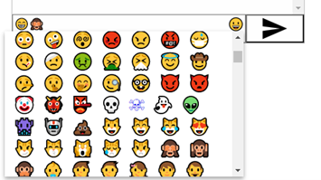
Typing some of the mostly used emoji shortcuts in the textbox will also change to an emoji when sending the message. The same applies for hyperlinks that are converted into clickable links in the chat bubble.
Conclusion
While web custom controls appear like complex magic black boxes at first sight, after some effort to learn their architecture and how to build them mapping to HTML elements, it turns out to be actually relatively straight-forward and doable. The advantage of TMS WEB Core certainly is that the built-in controls all come with full source code, so this is also a great resource to learn from. Using the Visual Studio Code IDE made it easy to immediately see the result on the form designer. Overall, I’m happy with the result. The chatbox will be integrated in the TMS WEB Academy application and will also become standard part of TMS WEB Core. I look forward to develop many more exciting web custom controls for TMS WEB Core!
Thank you
Thank you Bradley for a great collaboration during the internship. We look forward to go to the next level as a colleague in the tms family in July! The year went by fast and let's see who will take on the challenge to become an intern at tmssoftware.com in the next school year!
Bruno Fierens
Bookmarks:

This blog post has received 3 comments.
2. Thursday, July 8, 2021 at 3:36:21 PM
Pretty good job. I just have to make a similar component myself, and it''d be great to save me some work using this. Is it going to be available anytime soon?Romano Fulvio
 3. Thursday, July 8, 2021 at 3:39:25 PM
It will be included in TMS WEB Core v1.8.
3. Thursday, July 8, 2021 at 3:39:25 PM
It will be included in TMS WEB Core v1.8.It is actually already in the v1.8 beta (available now to TMS ALL-ACCESS users).
Bruno Fierens
All Blog Posts | Next Post | Previous Post
Pieter Scheldeman